Arbolt®
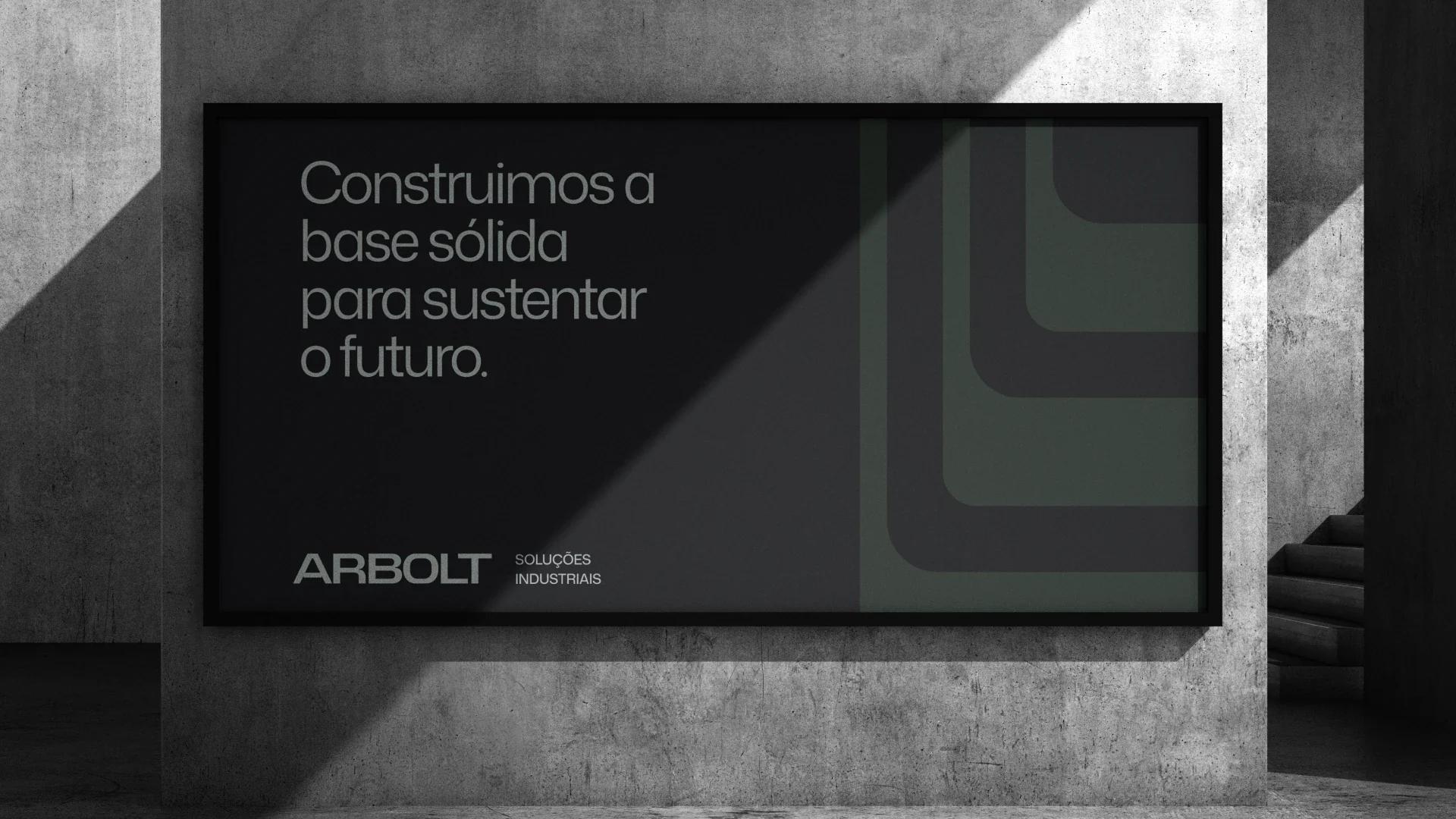
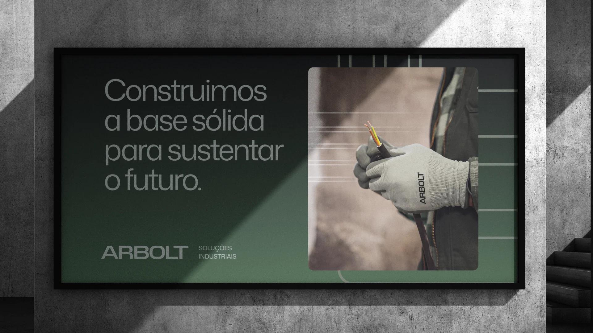
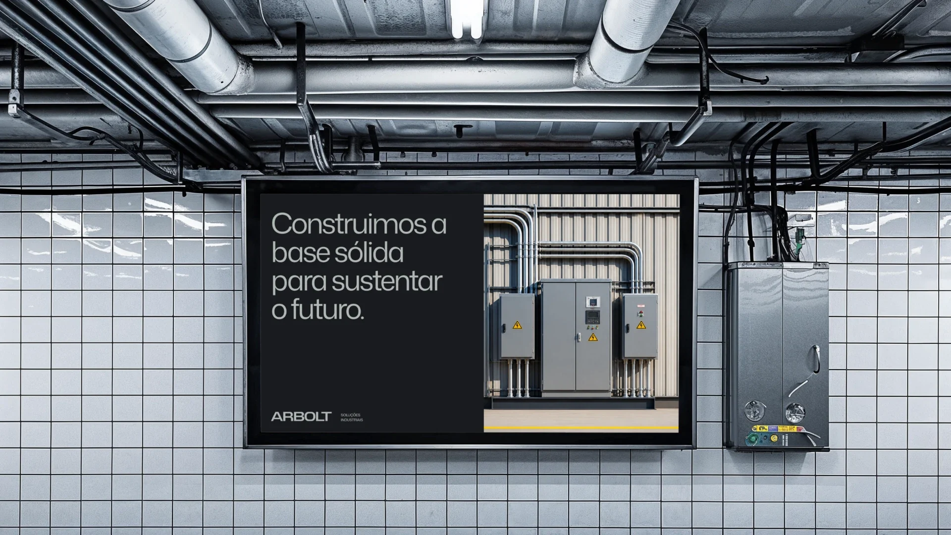
We build the solid base that sustains the future. Branding for an industrial solutions group.
( About the project )
The market suffers an identity blackout: few players have any visual system, the rest embrace the usual corporate blue, with generic logos and short acronyms. The raw aesthetic of the job site has vanished — smaller competitors hide their teams behind stiff technical talk and the giants spend their reach on industry 4.0. Arbolt found open ground to build presence in a new way.
Central theme: the electric root. It comes from a tree's roots — the part nobody sees but that holds up everything visible. Like the wiring and piping behind any structure, that invisible base becomes a geometric, solid engineering aesthetic.
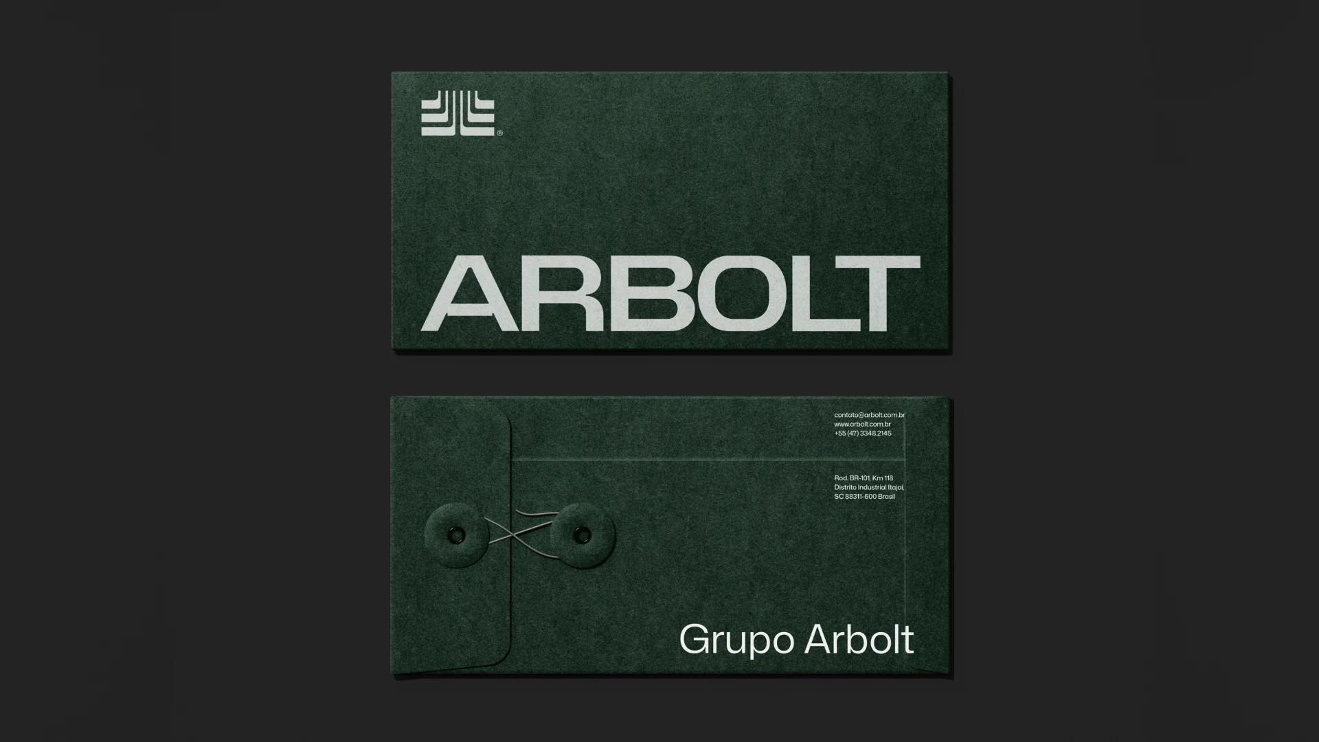
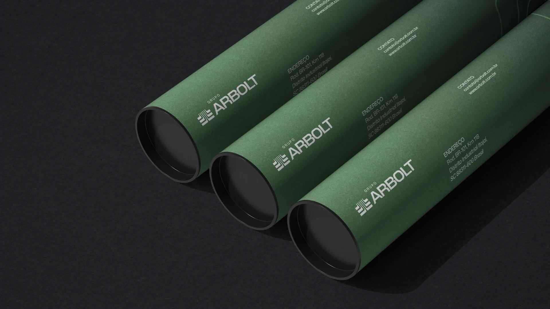
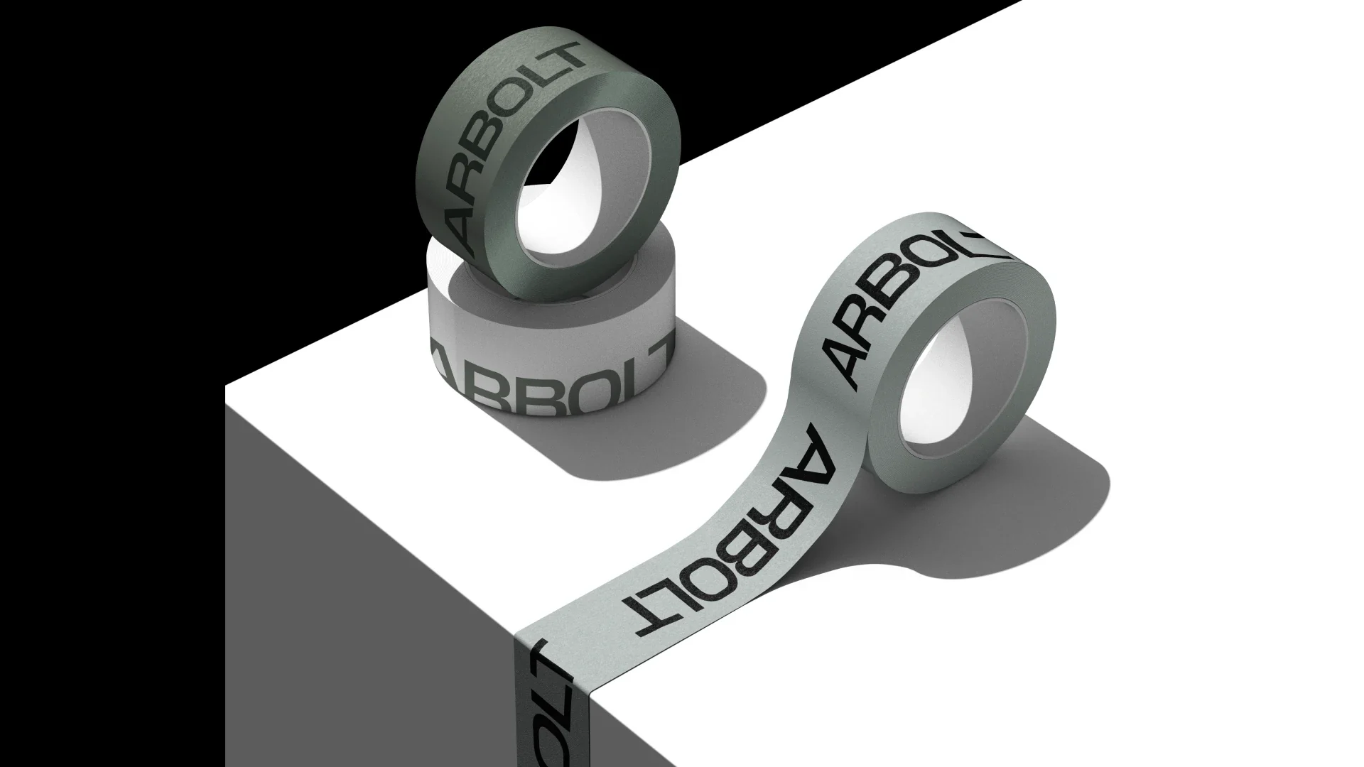
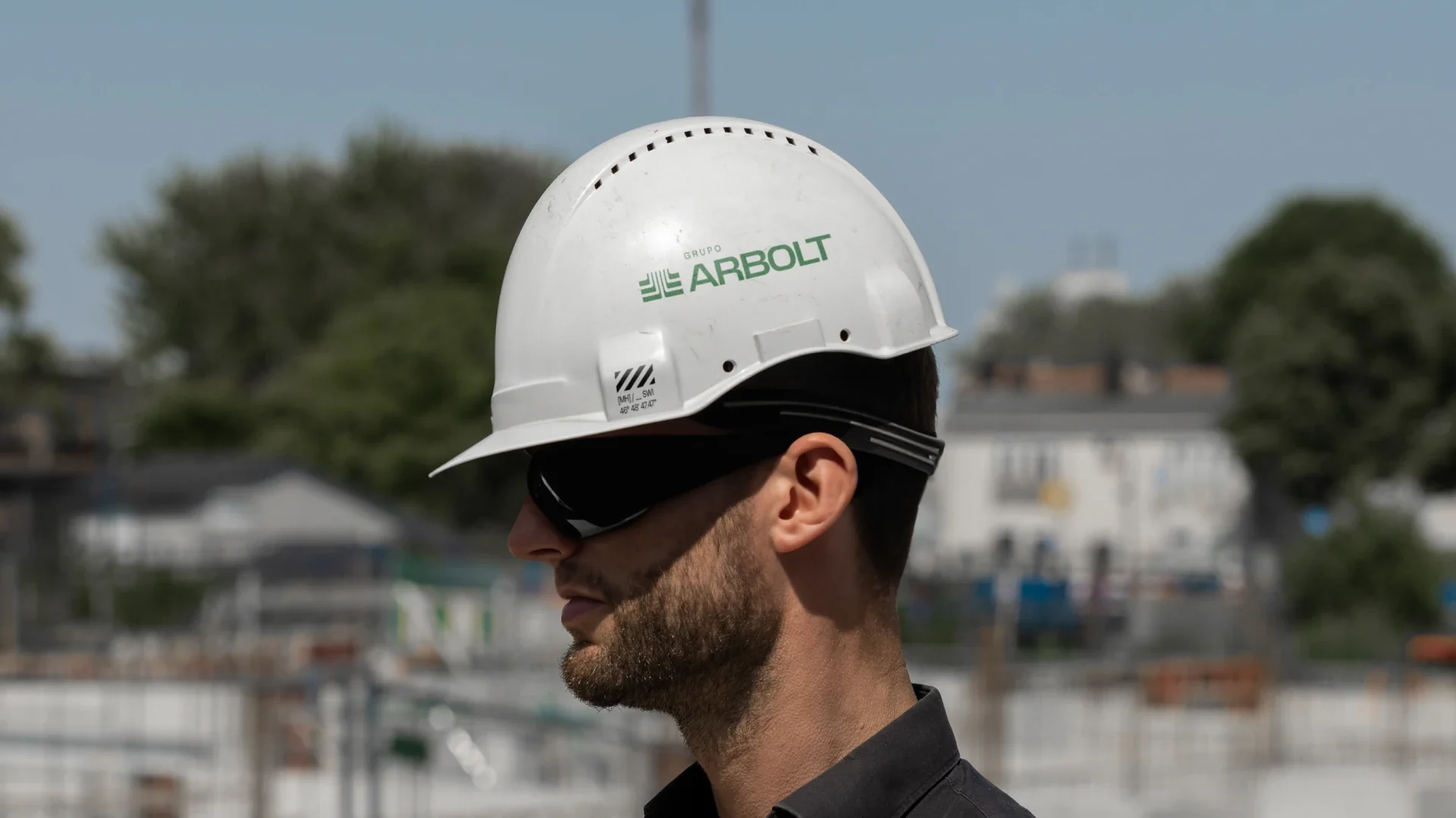
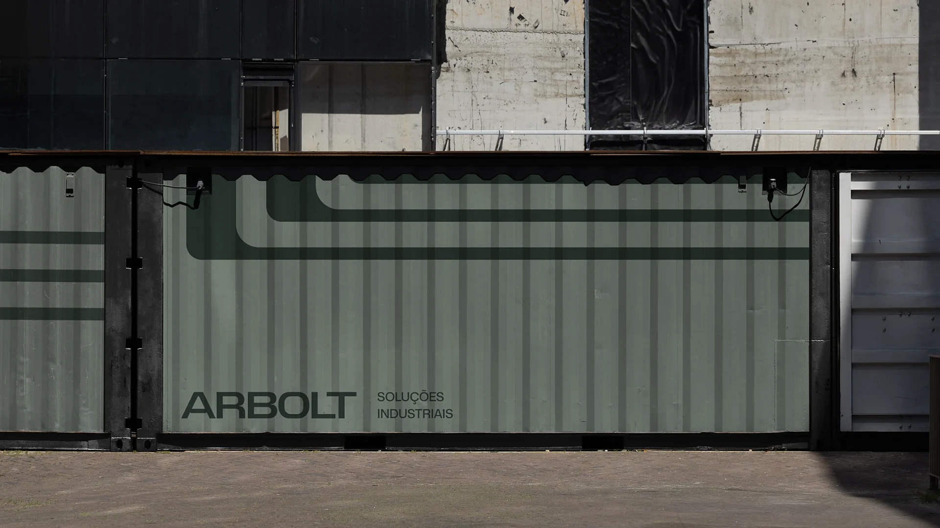
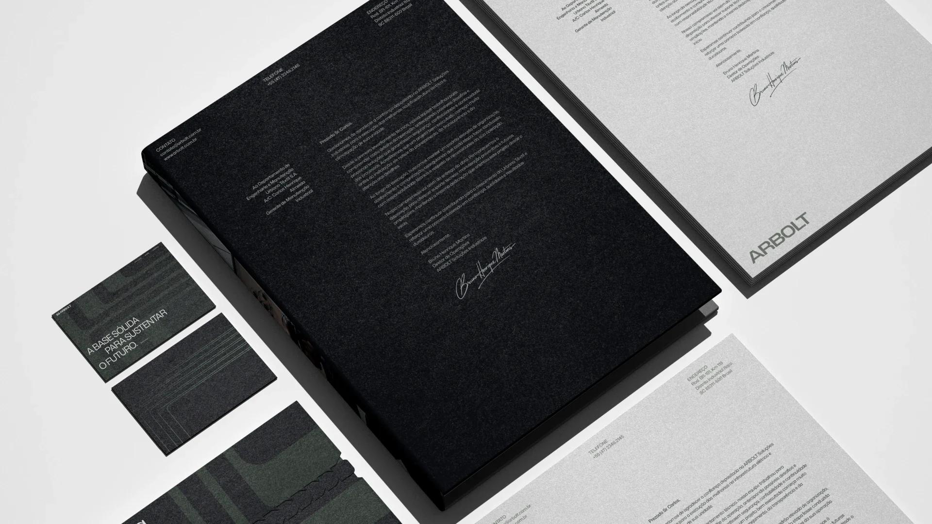
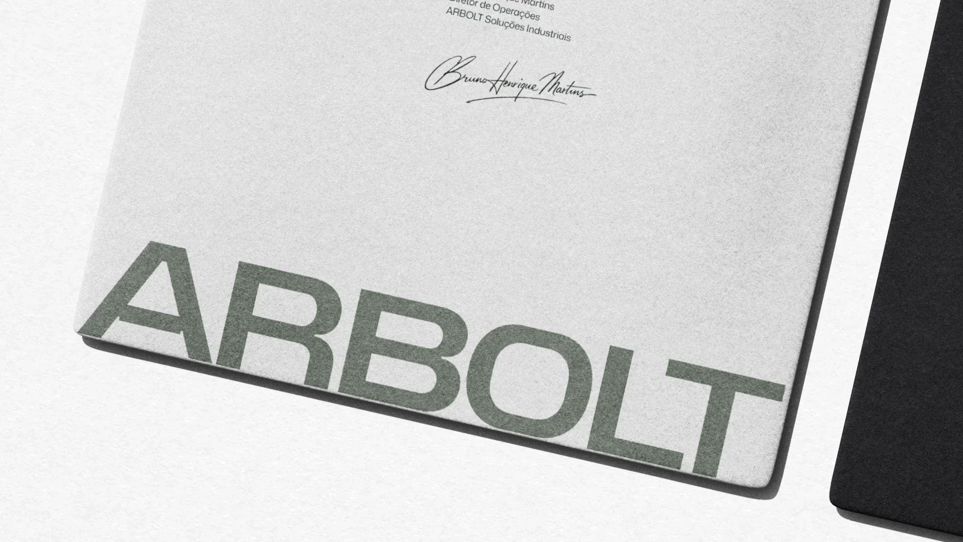
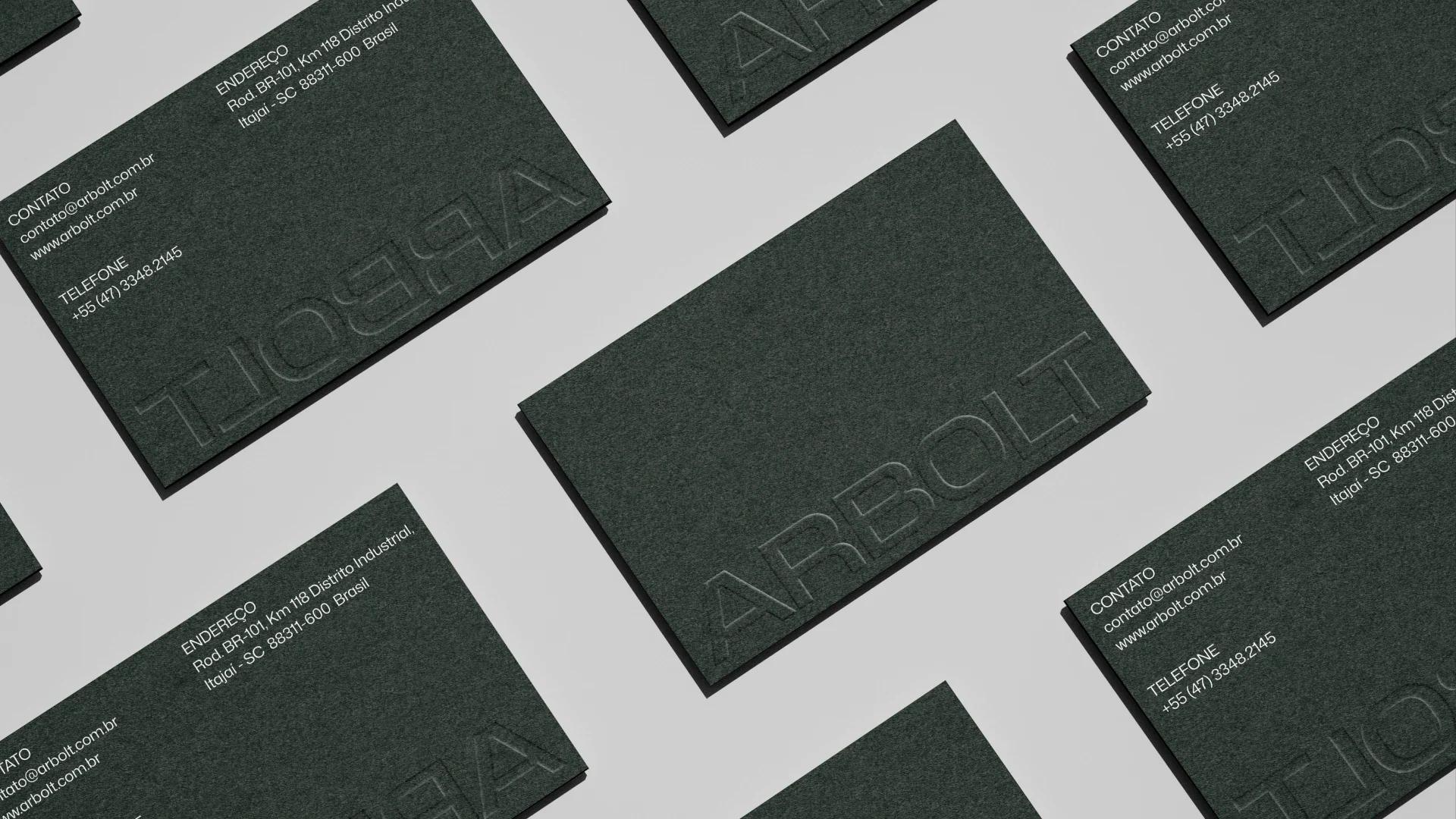
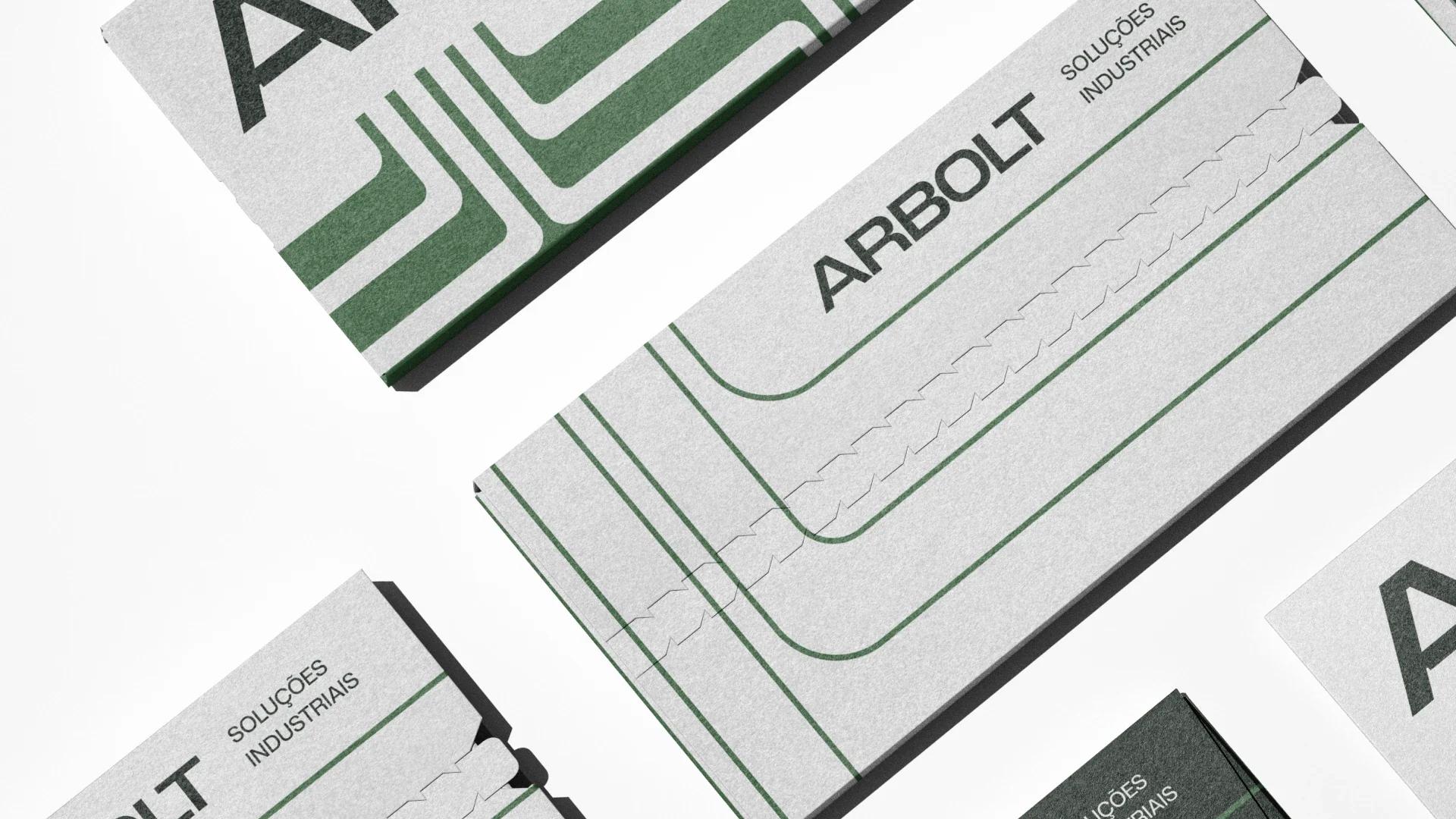
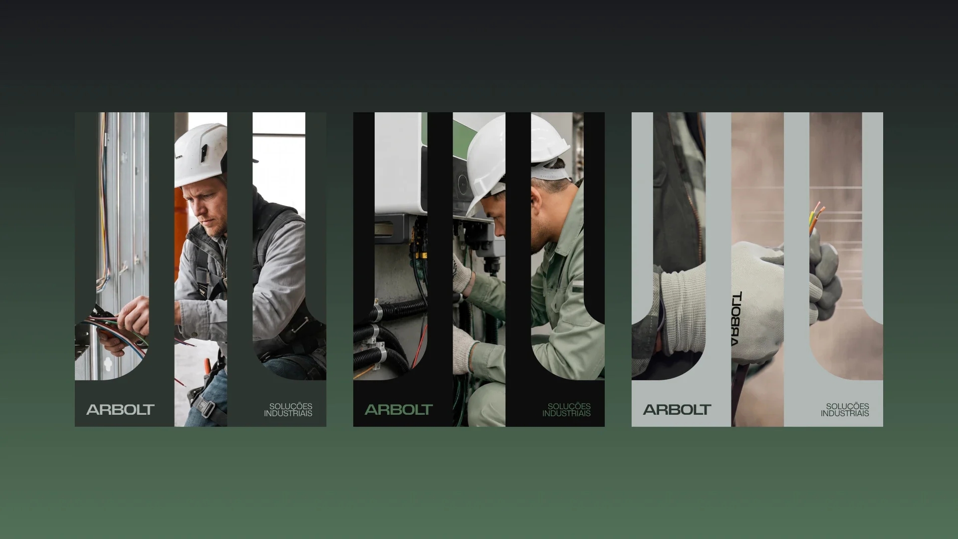
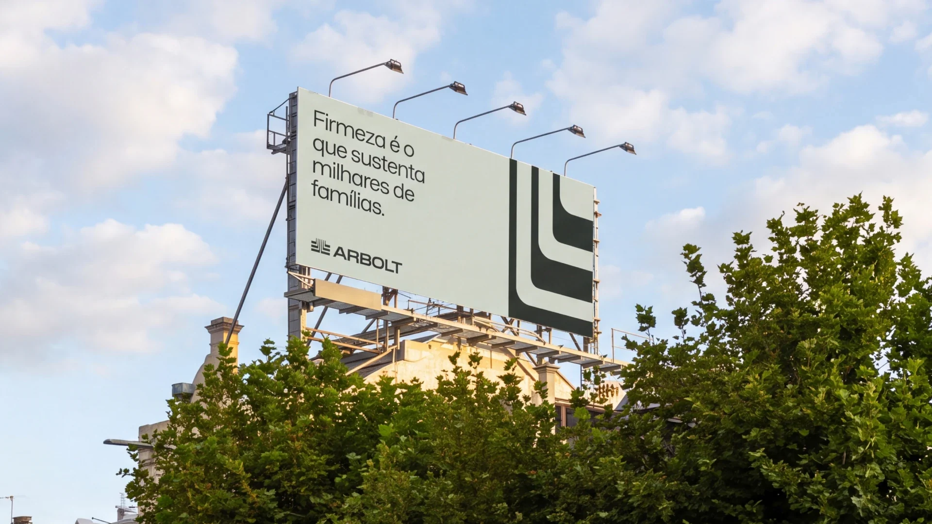
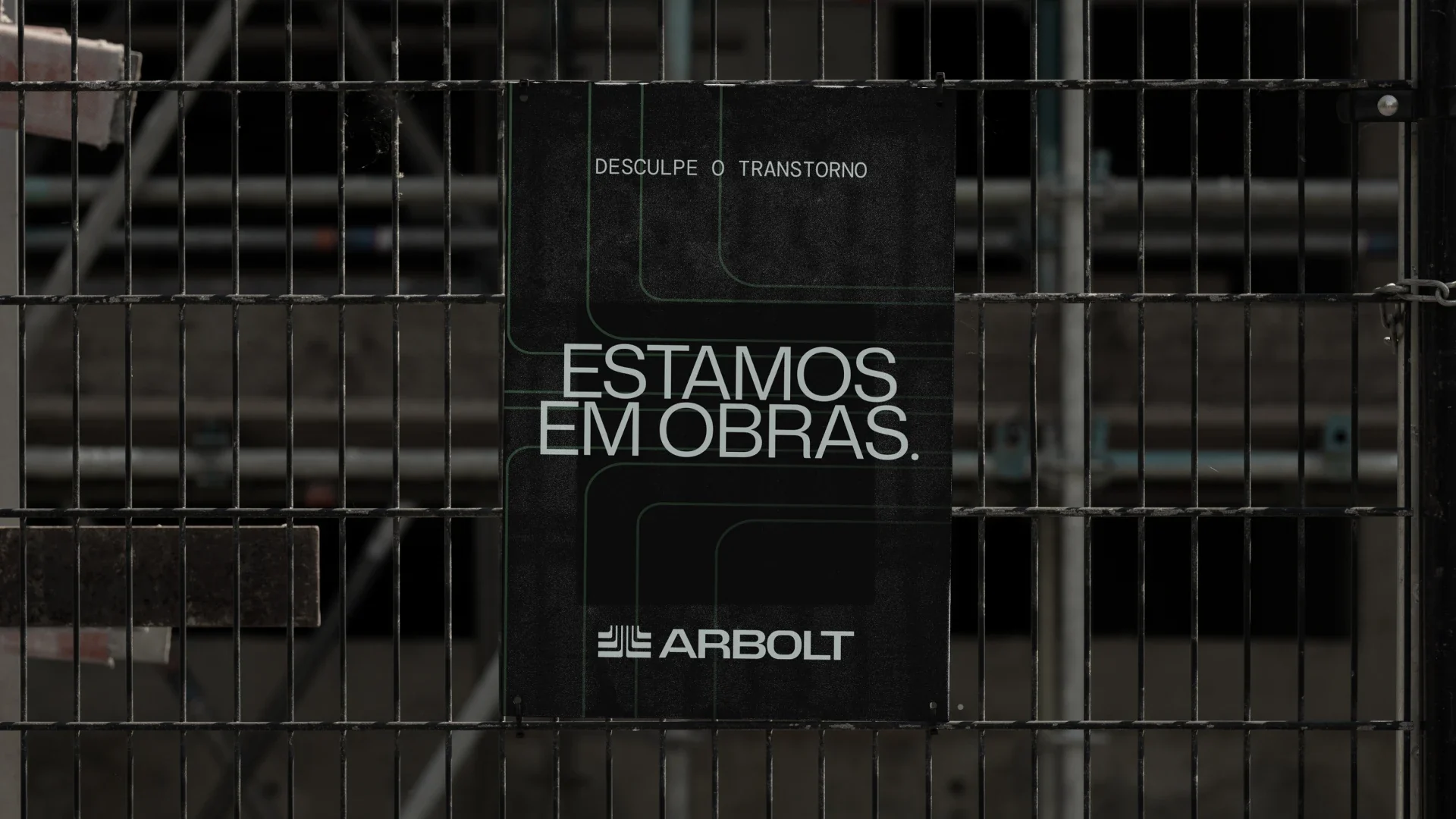
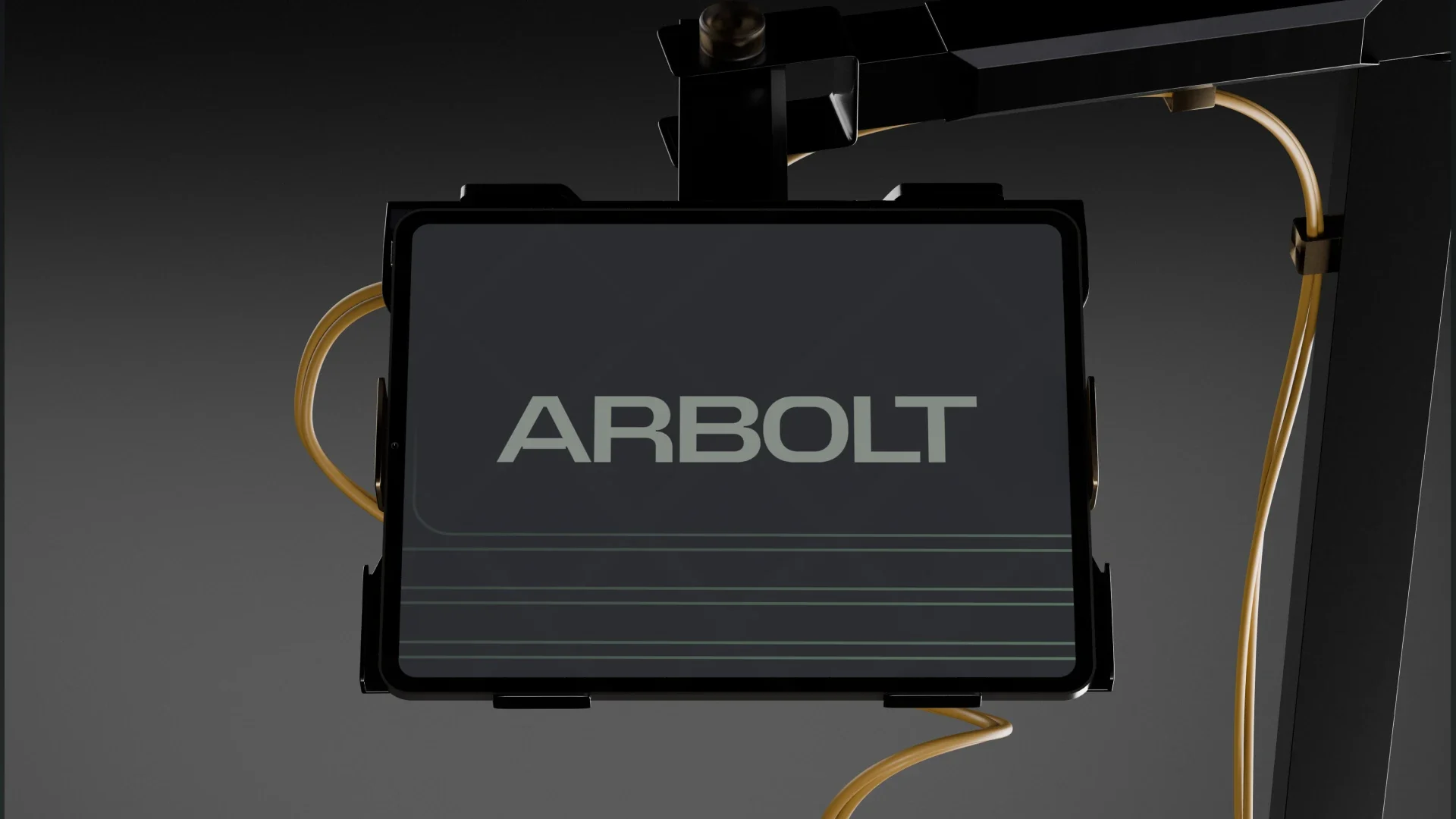
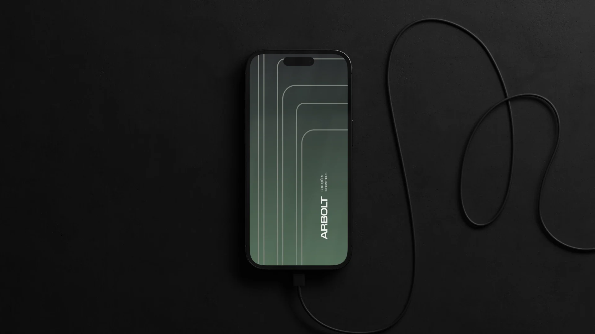
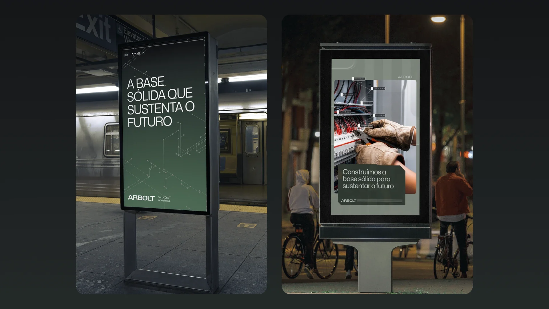
The symbol draws roots that descend and bend at precise angles, like cables in an electrical panel. Those parallel, round-cornered lines become a graphic system running through stationery, site signage, uniforms and campaigns, in a sober moss green over black and concrete grey.
Scope
Brand strategy · Visual identity · Art direction
Credits
Visant Studio®
Design: Guilherme Ayres, Flávia Cruz, Pedro Jaques, Pedro Xavier, Jeferson Gonçalves
Firmness is what sustains thousands of families.
Predictability
Deadlines, pricing, scope and all communication sound closed and definitive — the kind you can check tomorrow without fear they've changed.
Continuity
A presence that doesn't fade after delivery. A territory of permanence, distinct from the exactness of predictability.
Rigour
Technical competence shows in every touchpoint, so it's recognised as serious before any long explanation.


( Explore more work )