Urban Stay®
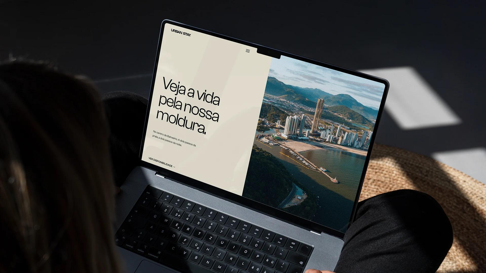
See life through our frame. Branding for a short-stay urban hospitality brand in the heart of Balneário Camboriú.
( About the project )
Balneário Camboriú is growing fast: record hotel occupancy, higher-income travellers and ever-shorter trips. But local hospitality hasn't kept up — on one side, sophisticated, expensive, corporate hotels; on the other, convenient and completely anonymous Airbnbs. In between, a whole territory with no owner: young, authorial hospitality with a real brand identity.
Urban Stay was born to take that space. Amid so much intensity — the beach a few steps away, the lights that never go out — the room was always just four walls to sleep in between plans. We thought it deserved more: the scent that greets you at the door, the shower after the sand, a good bed after a late night.
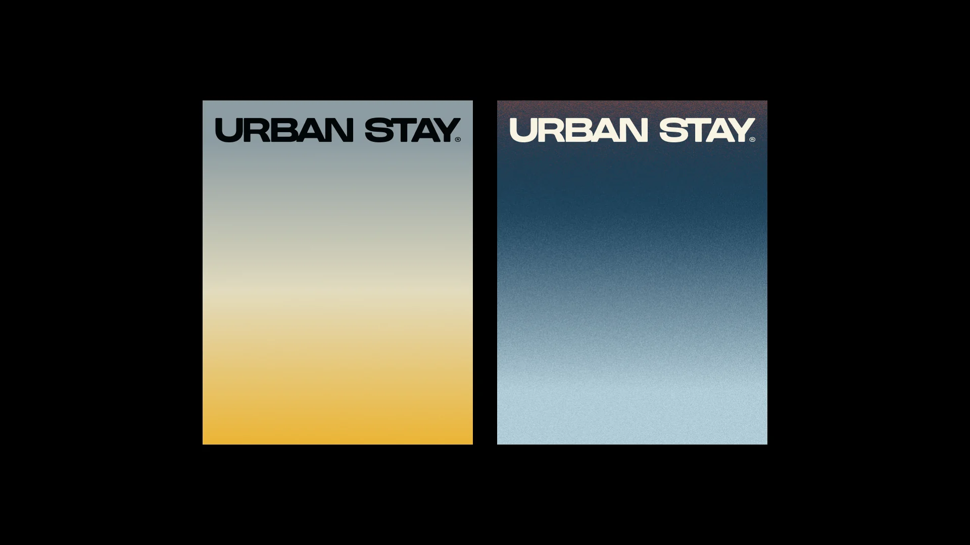
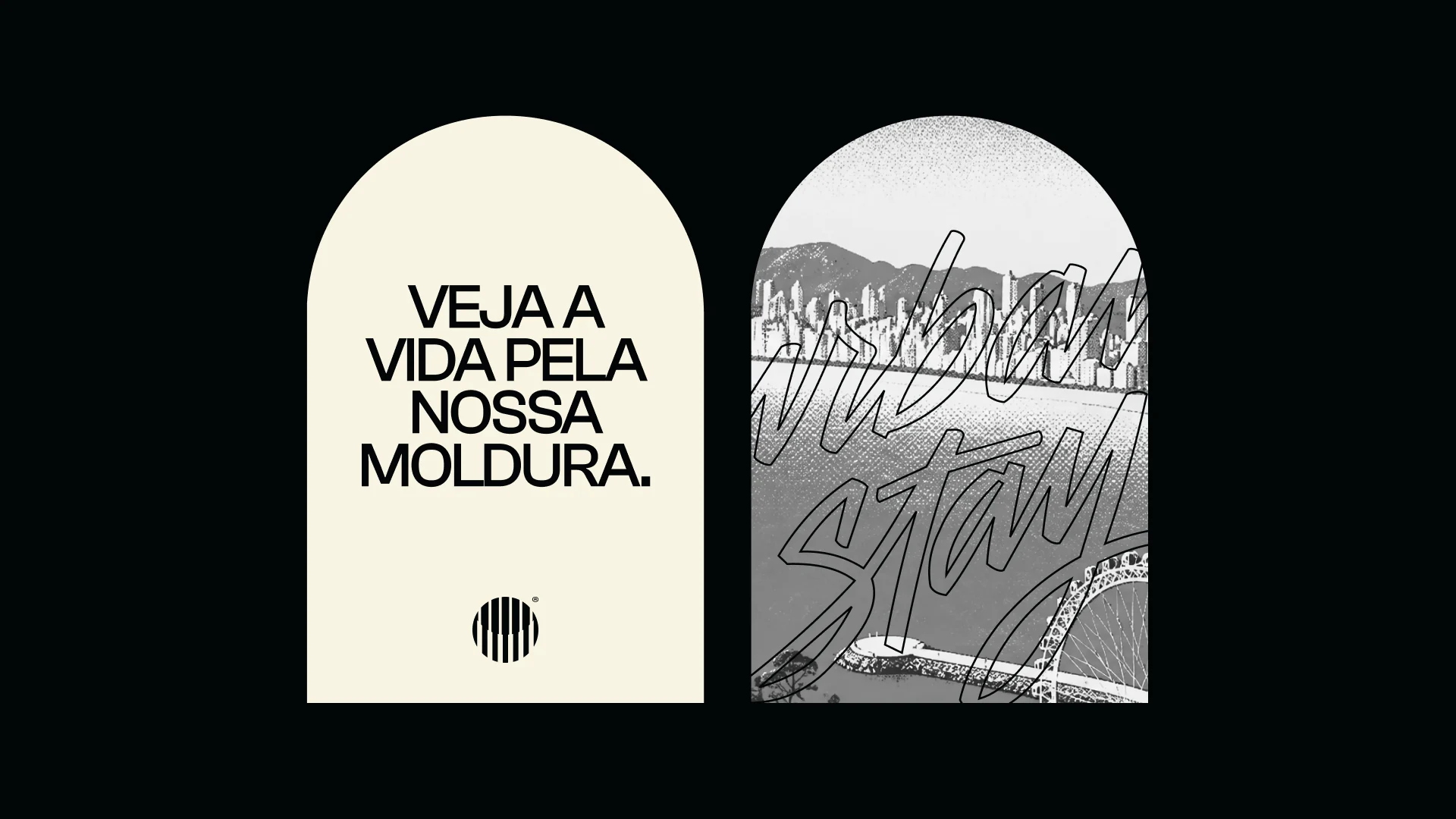
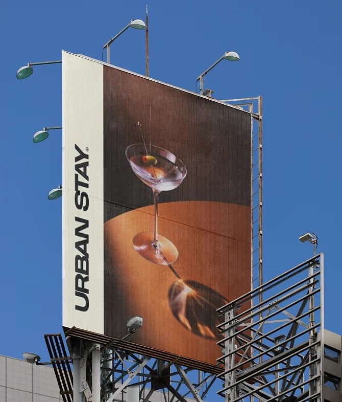
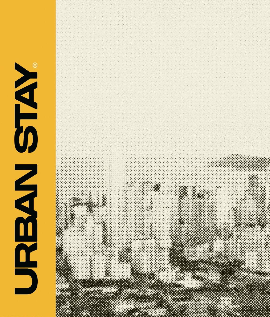
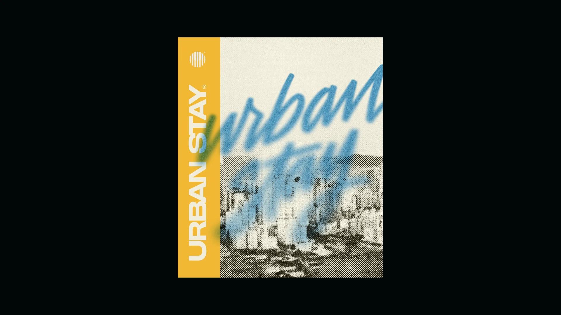
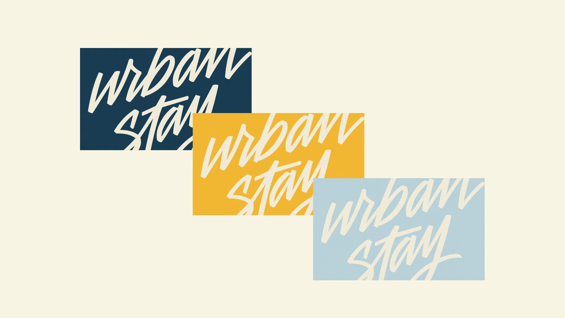
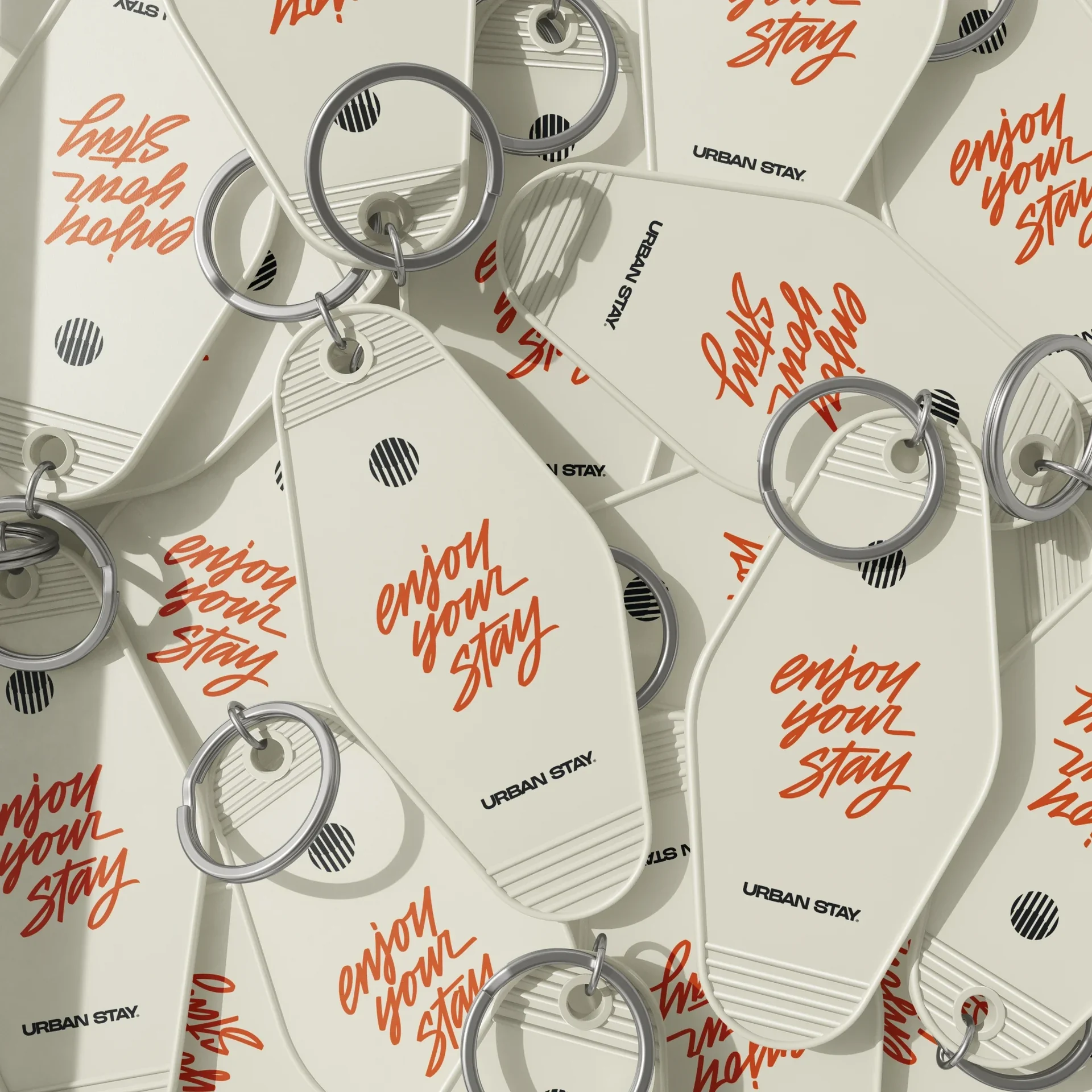
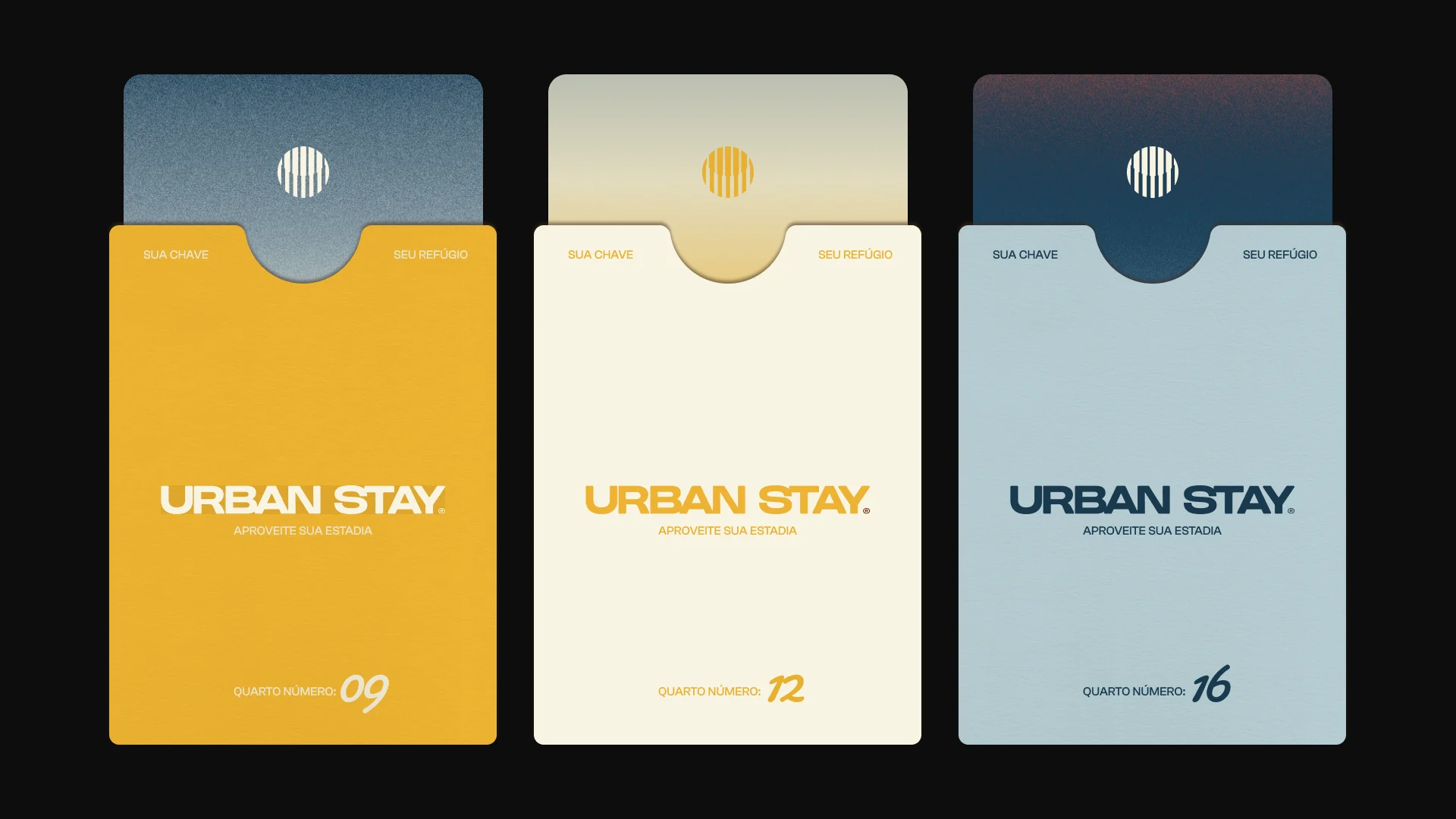
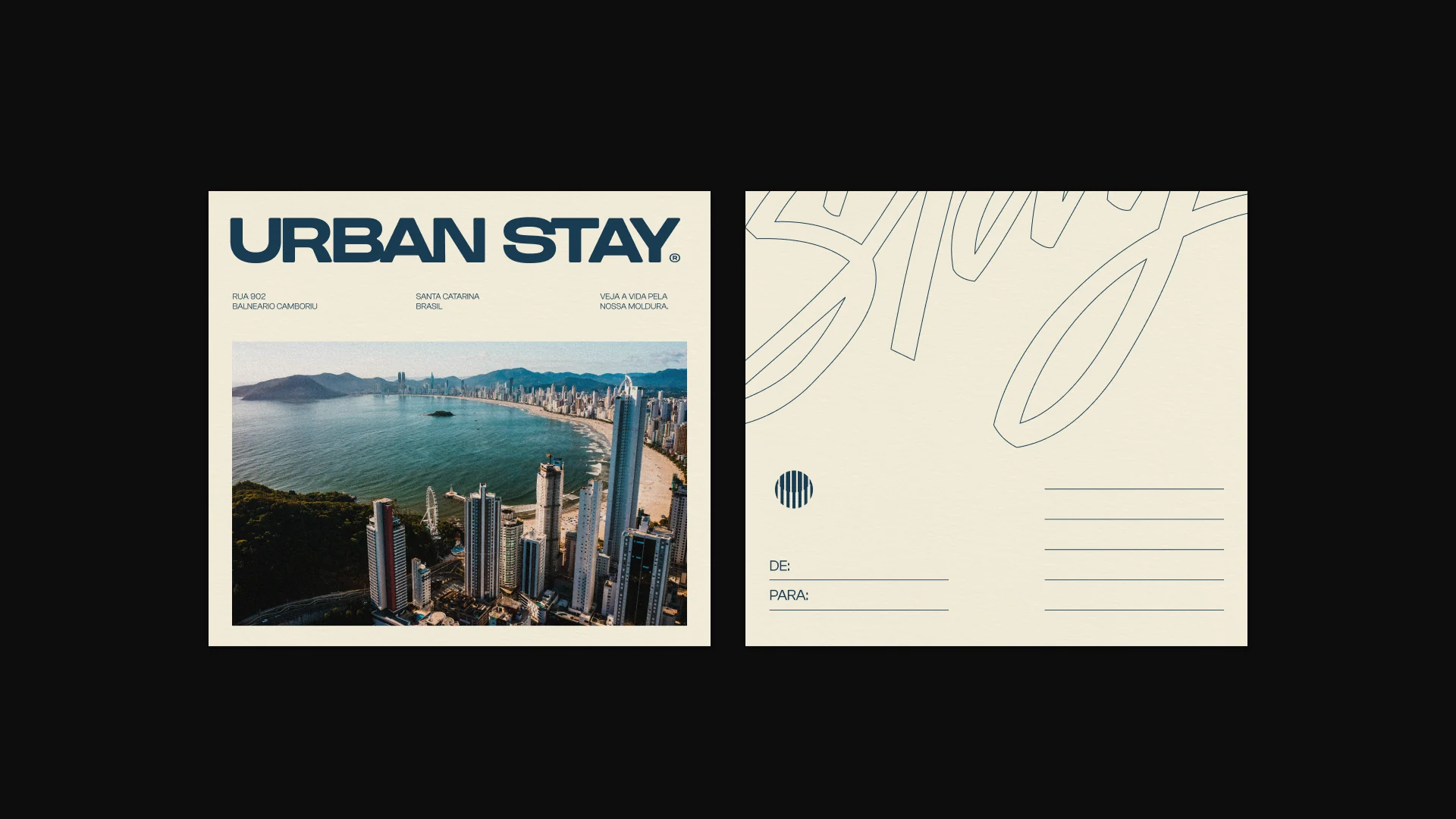
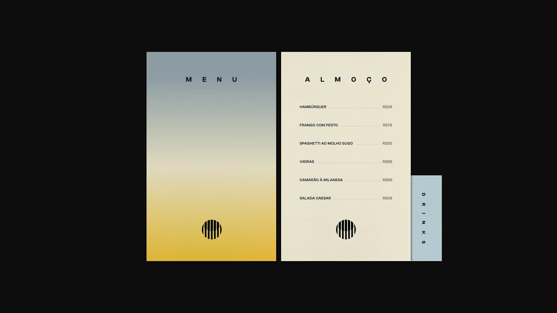
Central theme: the urban frame. The brand works as a lens that frames the beach and the night — a fixed frame with the living city as content. That gives us the recurring frame graphic, photography that is always framed, a grainy gradient that runs from sand to neon and hand lettering that brings the city's warmth to every piece.
Scope
Brand strategy · Visual identity · Art direction
Credits
Visant Studio®
Design: Guilherme Ayres, Flávia Cruz, Pedro Jaques, Pedro Xavier

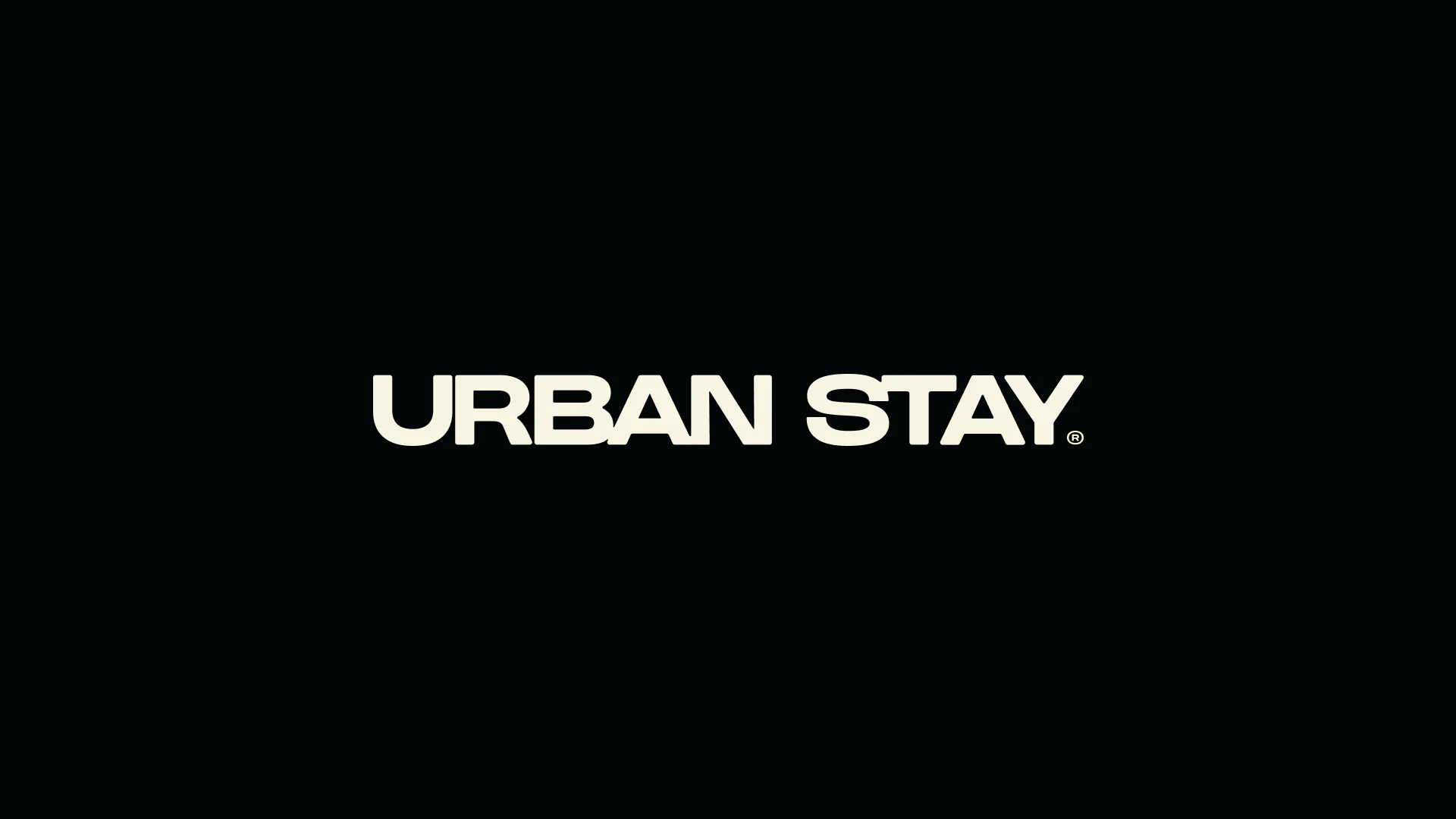
See life through our frame.
Vibrant
Urban Stay exists to capture the pulse of Balneário Camboriú: tall buildings, beach, night lights and constant movement. The brand isn't calm by default — it's energizing, with occasional pauses to breathe.
Sensorial
Walking into Urban Stay has to feel different from walking into any hotel. Guests sense the brand before they rationalize where they are — the signature scent, the packaging, the graphics on the wall. The experience starts at check-in.
Memorable
An ordinary stay is forgotten within days. At Urban Stay, the goal is to create moments guests want to photograph, post, recommend and come back for on their next free weekend.

( Explore more work )